
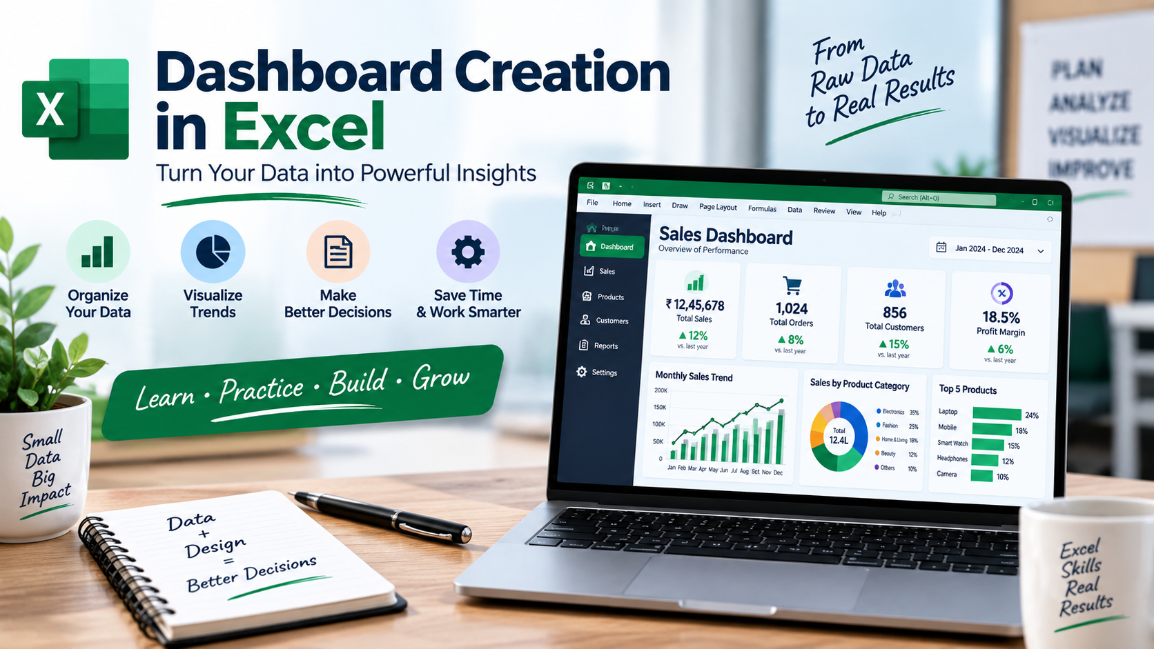
Creating a dashboard in Excel allows you to turn raw, messy rows of data into a clean, interactive, and one-page visual summary that helps stakeholders make decisions at a glance.
An effective dashboard follows a structured, modular architecture. It is best to avoid building everything on a single sheet; instead, organize your workbook into a three-tier system:
Tier 1: Raw Data
The untouched base data (often imported from SQL or a CSV).
Tier 2: Calculation Engine
Hidden sheets where Pivot Tables and formulas process the raw data.
Tier 3: The Dashboard Canvas
The clean, presentation-ready front end with charts, KPIs, and slicers.
Step-by-Step Guide to Building an Excel Dashboard
Step 1: Prepare and Clean Your Data
Before building visuals, ensure your data is structured properly.
- Select your raw data and press Ctrl + T to turn it into an Official Excel Table. Name the table something clear (e.g.,
SalesData). - Using an official table ensures that whenever you add new rows of data in the future, your dashboard charts and Pivot Tables will update automatically.
- Check for missing values, eliminate duplicate rows, and ensure your date columns are uniformly formatted.
Related learning: Master in Excel Certificate Course in Vadodara
Step 2: Create the Calculation Engine (Pivot Tables)
Instead of plotting charts directly from raw data, use Pivot Tables as an intermediate layer to aggregate the metrics.
- Go to Insert > PivotTable and choose your
Sales Datatable. - Build separate Pivot Tables for each metric you want to display (e.g., one table for Sales by Month, one for Top 5 Products, and one for Regional Performance).
- Place these Pivot Tables on a dedicated sheet named
Calculations.
Step 3: Design the Dashboard Canvas (UI/UX Layout)
Open a brand new sheet and name it Dashboard. This is your visual canvas.
- Remove Gridlines: Go to the View tab and uncheck Gridlines. This instantly gives your dashboard a clean, professional web-application feel.
- Choose a Color Palette: Pick 2 to 3 primary colors. Avoid using overly bright, saturated colors. Use muted shades for standard data and a single bold accent color to draw attention to critical insights.
- Build a Header Block: Select the top 2-3 rows, fill them with a dark or neutral color, and add a bold title (e.g., Q3 Executive Performance Dashboard).
Step 4: Set Up KPI Cards (Key Performance Indicators)
KPI cards sit at the very top of your dashboard and display the most critical high-level numbers (e.g., Total Revenue, Net Profit, Total Orders).
- Go to Insert > Shapes and draw a rounded rectangle.
- Click on the formula bar, type
=, navigate to yourCalculationssheet, and select the total cell from one of your Pivot Tables. Press Enter. - The shape is now dynamically linked to your data. Format the text to be large, bold, and centered.
Step 5: Insert Dynamic Charts
Go back to your Calculations sheet, click inside a Pivot Table, and go to PivotTable Analyze > PivotChart. Choose the chart type that best fits the data narrative:
Line Charts
Best for showing trends over time (e.g., Monthly Revenue).
Bar/Column Charts
Best for comparisons (e.g., Sales by Product Category).
Donut Charts
Best for displaying simple asset allocations or percentage contributions (keep slices under 4 for readability).
Cut the generated chart (Ctrl + X) and paste it (Ctrl + V) onto your Dashboard sheet. Style the chart to match your chosen color palette, remove unnecessary gridlines inside the chart, and clear out repetitive legends.
Related learning: Power BI Course in Vadodara
Step 6: Add Interactivity with Slicers
Slicers act as visual filters that allow users to customize the data view dynamically.
- Click on any chart on your dashboard, go to the PivotChart Analyze tab, and click Insert Slicer.
- Select the fields you want to filter by (e.g., Year, Region, Sales Manager).
- Crucial Step: By default, a slicer only controls the single chart you selected. Right-click the slicer, choose Report Connections, and check the boxes for all the Pivot Tables in your workbook. Now, clicking a button on the slicer will update the entire dashboard simultaneously.
The Golden Rules of Dashboard Design
The F-Shape Layout Rule
Place your most critical high-level metrics (KPI cards) across the top row or down the left column. Users naturally scan screens in an ‘F’ pattern.
Keep it on a Single Screen
A true dashboard should not require vertical or horizontal scrolling. Force yourself to fit the core story onto one clean screen view.
Context is King
A number like $500,000 means nothing without context. Always include a small label underneath it showing a comparison metric, such as +12% vs Last Quarter or Target: $450,000.