
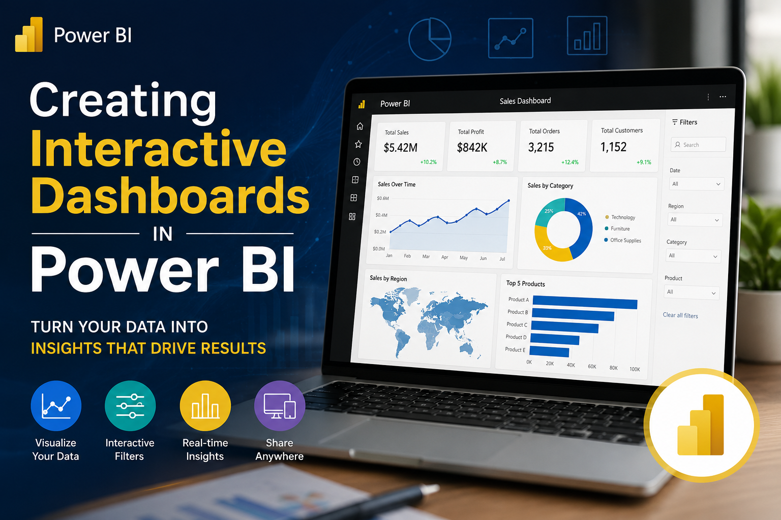
While Excel is fantastic for quick data manipulation and prototyping, Microsoft Power BI is the industry standard for enterprise-grade, interactive data storytelling. It can easily handle millions of rows, connect directly to cloud databases, and auto-refresh reports in real time.

Building a Power BI dashboard requires a structured, end-to-end framework often called the Data Pipeline lifecycle. Here is the step-by-step process to build a high-performing interactive dashboard.
The 4-Step Power BI Architecture
Step-by-Step Dashboard Build
Step 1: Get & Transform Data (Power Query)
Before you drop charts onto your canvas, you must ensure your data is clean and uniform.
1. Click Get Data in Power BI Desktop and select your source (SQL Database, Excel, Web, CSV, etc.).
2. Click Transform Data to open the Power Query Editor.
3. Perform standard data hygeine:
Fix Data Types: Ensure date columns are formatted as `Date`, and monetary values are `Fixed Decimal Number`.
Remove Nulls/Duplicates: Clean out empty rows or corrupted records.
Unpivot Columns: Transform wide tables (e.g., columns for Jan, Feb, Mar) into long, narrow analytical tables for faster processing.
Step 2: Establish the Semantic Model (Data Modeling)
A common mistake beginner make is dumping everything into one giant flat spreadsheet. For complex, responsive dashboards, map your data into a Star Schema layout within the Model View:
Fact Tables: Your central transaction table containing numeric values and metrics (e.g., `Fact_Sales` with Revenue, Quantity, OrderDate).
Dimension Tables: Surrounding lookup tables containing descriptive attributes (e.g., `Dim_Customers`, `Dim_Products`, `Dim_Geography`).
Relationships: Create 1-to-Many (`1:*`) relationships** linking unique IDs from your Dimension tables to the matching keys in your Fact table. Ensure cross-filter directions are set to single for optimal speed.
Step 3: Write Key Metrics (DAX Fundamentals)
Do not drag raw numeric columns directly onto charts. Instead, build explicit calculations using DAX (Data Analysis Expressions).
Create a dedicated table to house your measures, and start with core business metrics:
Total Revenue:
“`dax
Total Revenue = SUM(Fact_Sales[Revenue Amount])
Year-Over-Year (YoY) Growth:
“`dax
YoY Revenue Growth =
VAR CurrentYearSales = [Total Revenue]
VAR LastYearSales = CALCULATE([Total Revenue], SAMEPERIODLASTYEAR(‘Dim_Date'[Date]))
RETURN
DIVIDE(CurrentYearSales – LastYearSales, LastYearSales, 0)
Step 4: Build the Visual Interface
Switch to the Report View to begin designing your user experience.
1. Set Up the Canvas Background: Choose a professional layout. You can use a very light grey background (`#F3F4F6`) with crisp white visual containers to help charts pop cleanly.
2. KPI Headline Cards: Place standard card visuals across the top of your report to show key summaries (`Total Revenue`, `Profit Margin`, `Total Active Users`).
3. Choose the Right Core Visuals:
Time-Series Analysis: Use a Line Chart to map trend variations over months or quarters.
Categorical Breakdowns: Use a Clustered Bar Chart to evaluate product categories or regional performance.
Contribution Analysis: Use a Matrix Visual for a structured drill-down look at financial numbers.
Engineering Advanced Interactivity
Power BI shines brightest through its native slice-and-dice interaction layers. Make sure to activate these three features to build a dynamic app-like experience:
1. Cross-Filtering and Highlights
By default, clicking on a specific data segment in one chart (e.g., selecting “Electronics” on a bar chart) will automatically highlight or filter all other charts on the page.
Pro-Tip: If you want a specific chart to remain unchanged when filters are clicked, go to the Format tab, click Edit Interactions, and select the None icon on that visual.
2. Drill-Through Actions
Instead of cluttering a single screen with details, let users deep-dive into specifics. Create a secondary, detailed page (e.g., *Customer Deep Dive*). Drag the `Customer Name` field into the **Drill-through filters** well on that second page. Now, users can right-click any customer name on the main dashboard and instantly jump to that person’s detailed transaction history.
3. Tooltip Canvas Overlays
Standard tooltips display basic numbers when a user hovers over a chart element. Power BI allows you to design an entirely separate miniature page and use it as a custom hover card. Hovering over a regional map, for example, can trigger a mini tooltip line graph showing that specific region’s 12-month sales trajectory.
The Pro Dashboard Checklist
Keep Slicers Collapsible: Use the Bookmarks and Selection Pane to build a slide-out filter panel. This keeps your canvas clean and maximizes real estate for your core charts.
The 5-Second Test: A stakeholder should look at your dashboard and understand the top core business insight within 5 seconds without scrolling.
Limit Color Variance: Use a single cohesive brand theme. Use neutral tones for 90% of the dashboard elements, reserving a vibrant action color (like navy blue or teal) exclusively to draw eyes to critical anomalies or targets.